Lapilli
Brand - Lapilli
Customer - Argea
Country - Italy
Argea, a group of leading companies in the sector that have come together to represent and promote Italy's outstanding wine-growing ecosystem.
The customer needed to redesign and reposition the Lapilli brand, a range of wines from the volcanic region of Campania.
In Latin, Lapilli means 'small stones' and refers to all the materials produced during a volcanic eruption.
The customer wanted to bring out the essence of its products through the design of the bottle.
Gentlebrand responded to the challenge by starting from a very clean, minimalist label, which saw the brand name as its main element, and suggested a completely new design.
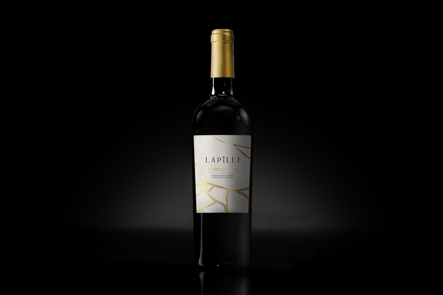
A design in which the bottle fully expresses the identity of the product thanks to the introduction of a new distinctive element and characteristic traits in the label that best represent the brand image.
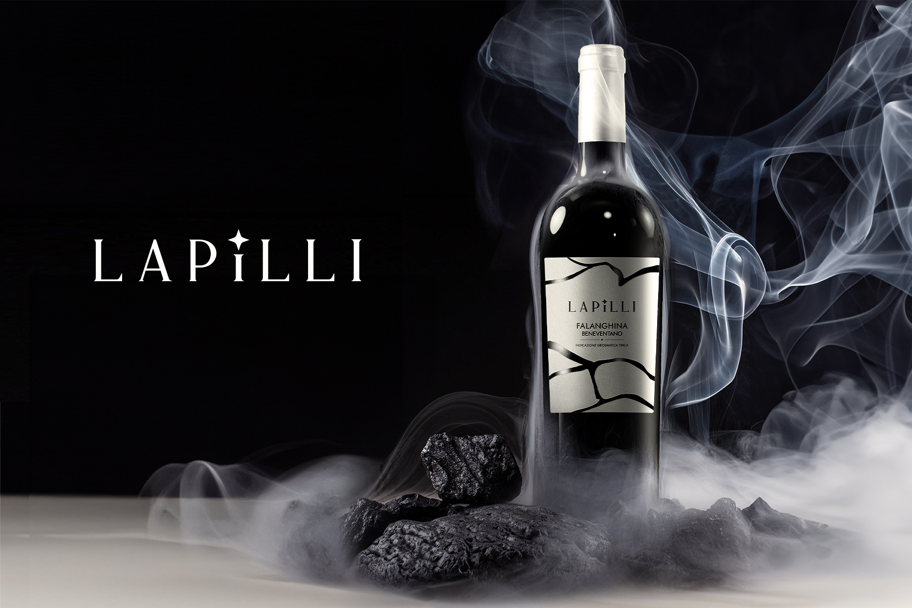
This new series of labels evokes lava as something powerful, iconic and visually striking.
The colours chosen to represent the different wines bring to mind the journey that the lava has made, bright red at the moment of eruption, red-hot with streaks of gold as it descends the volcanic slope, and finally shiny black after it has cooled down.
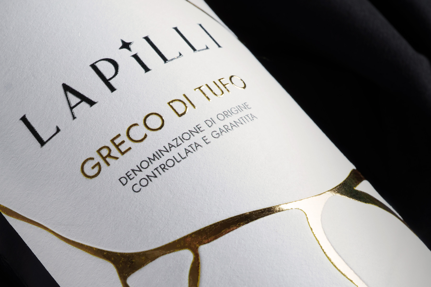
The common thread is a magmatic texture, rich in tactile elements that bring out the physical aspect of the earth and the effect caused by the lava flow.
A coarse type of paper covered in cracks, where various design features highlight the lava flows.
Gold colours enhance the cracks in the earth and embellish the texture.
Four different labels which, placed side by side, create a unique design and together form the new Lapilli family.
Each label is characterised by a different colour, to better suggest the notes of the wine it goes with.


